
Website Redesign for Learnerator
Skills: Research, UX Design, UI Design
Tools: Photoshop, Illustrator, Adobe XD
Learnerator (now Albert.io) is an online exam prep-website that helps students prepare for college entrance, AP, literature, and graduate exams. During the project phase of Designation Lab's UX/UI bootcamp, I worked with a four-person team to redesign the company’s website.
Diving In
My team began the project with an in-depth discussion with company’s head designer about Learnerator’s goals and vision for the future as well as what he thought could be improved about the current site. From there, we did our own mini-round of usability testing, observing new users trying to perform specific common tasks on the site and having them walk us through their impression of the platform as they arrived at different pages. Each team member then completed a heuristic evaluation of the main pages of the site which, in combination with our previous research, helped us figure out the most important areas to focus on over the course of our two-week redesign.
We narrowed our focus to four major goals which were:
1. Reimagine the Home Page
Rethink the site’s home page design so that visitors understand Learerator’s purpose and are compelled to try it out.
2. Condense the Sites’s Footer
Figure out how to reduce the size of the footer while still allowing users to quickly get to where they want on the site.
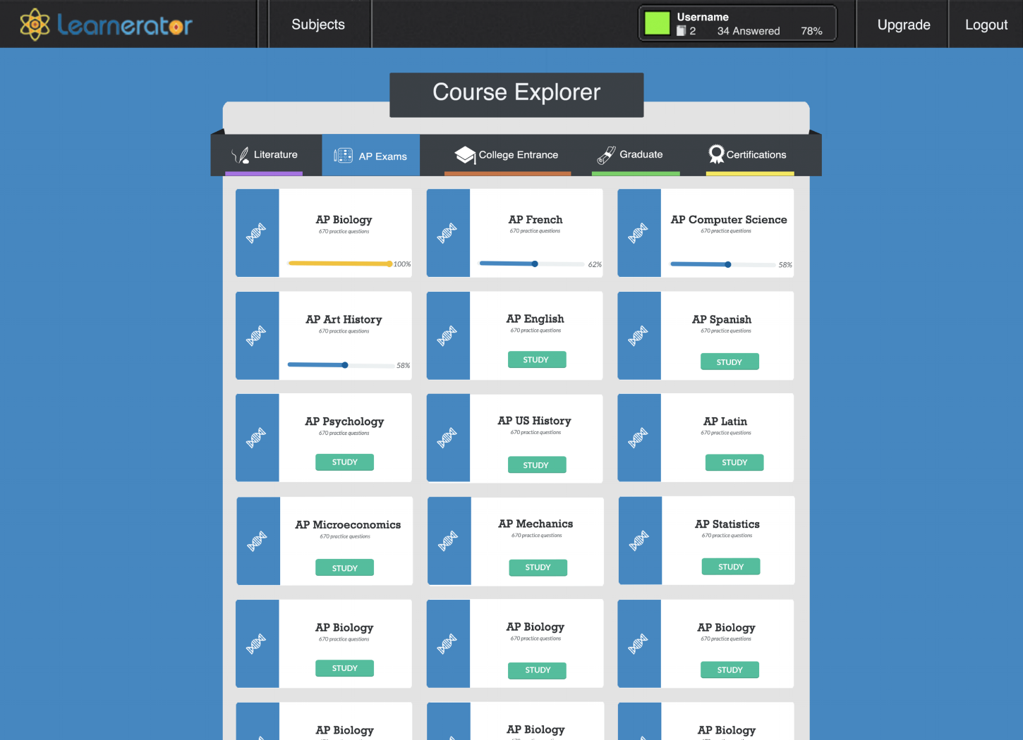
3. Redesign the Course Explorer
Make it easier for users to discover relevant classes and track their progress through the testing prep.
4. Improve Cohesion Across the Site
Update the site’s pages to create a uniform look and feel for the brand.
Concept Generation


Once we finalized our goals, the team got to work determining our direction for the project. After some whiteboard ideation and discussion over our different ideas, we divided to create a basic digital wireframe of our site. We each took on different parts of the wireframe and used our agreed upon header/footer styles and standard colors/font sizes to test out our initial concepts and create a primitive site layout. These designs provided an opportunity to receive effective feedback Learnerator team and provided our team direction as we split off to further flesh out different parts of the redesign.
Improving The Home Page
Reimagining the Call to Action
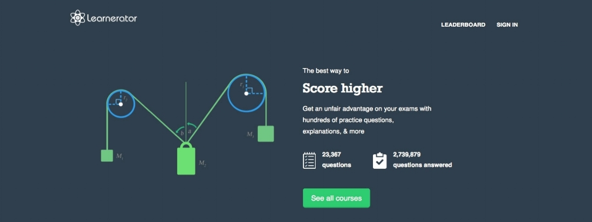
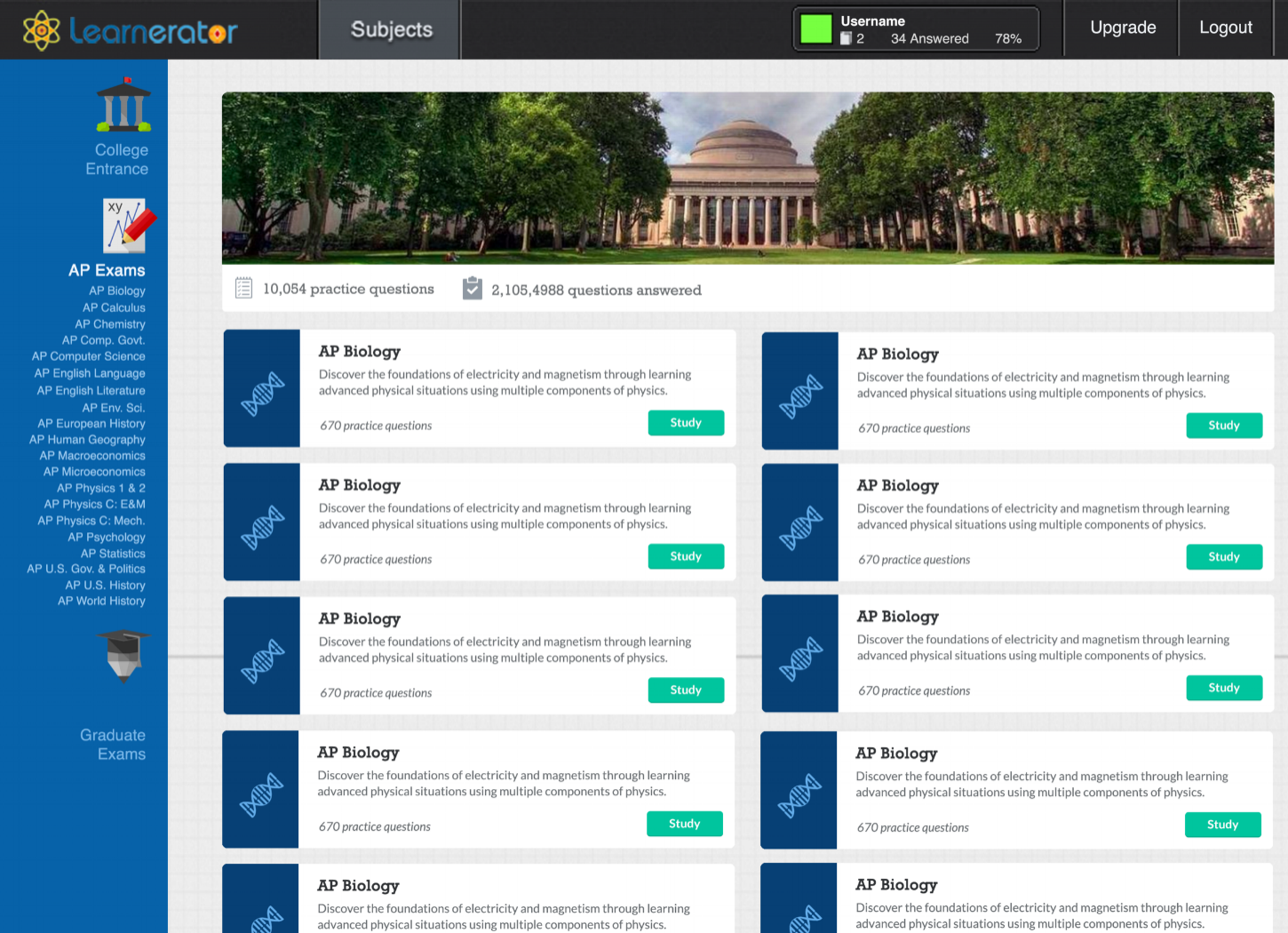
Our first objective was improving the home page’s effectiveness at showcasing the site and drawing in new users. Learnerator’s original home page had a physics diagram alongside a short site description and a call to action of “See All Courses”, which didn’t spark much excitement for Learnerators content left some first-time users confused about the purpose of the site. (A few of our test users initially thought the site was only for technical courses, when in reality it offered tests on a much wider range of subjects.)
Mini-Quiz Concept

Interactive prototype of our mini-quiz concept coded by my team member Angela
To solve this problem, we decided to create interactive flashcards covering a variety of subjects as a sort of mini-quiz for first timers to the site. Our thinking was that the notecards would not only showcase the wide range of subjects offered, but would also get users interacting with the content and pull them into the main page of the site, where they could browse courses.
Footer Redesign
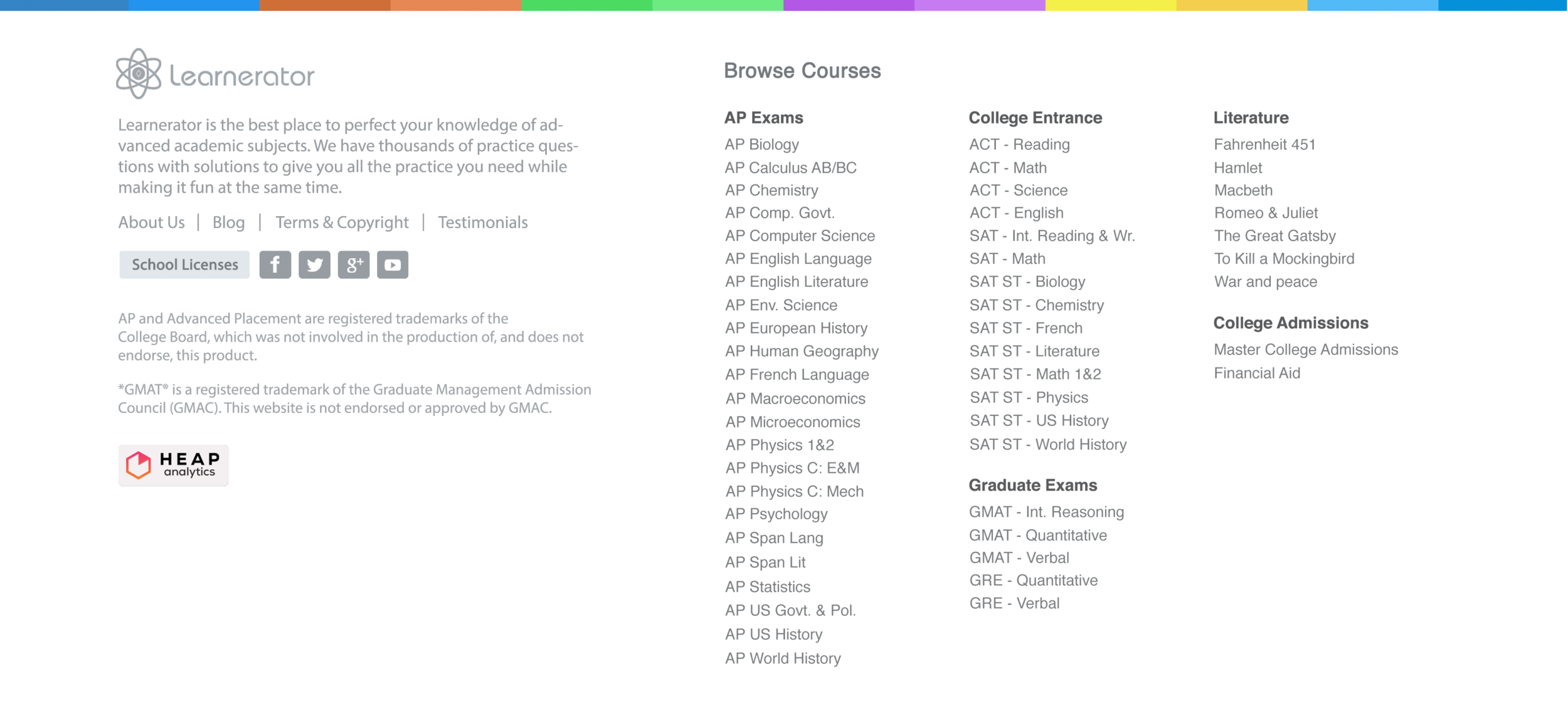
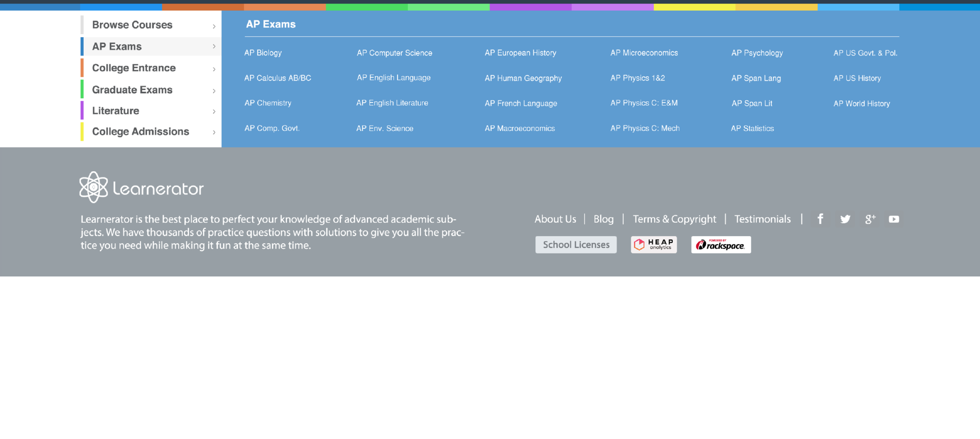
Along with remodeling the top portion of the site homepage we also re-examined the site’s footer. Originally, it had made sense for Learnerator’s footer to link to every course they had prep material for. However, as their offerings had grown from a few subjects to over 50, the footer had become excessively long and distracted from the rest of the content. In talking with users, we discovered that most student were coming to Learnerator just to study for one or two specific subjects, and didn’t necessarily need links to every subject available to them at all times. We devised a filtering system color-coded according to the rainbow scheme on the original front page and cleaned up the rest of the footer by bumping the licensing and information section to an internal page.
Client Feedback and Revisions
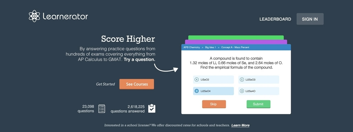
When we brought this proposal to the client, however, he was very insistent on having all courses always be a click away, and asked us to return to a footer that displayed all courses at once. He was also unsure as to if the mini-quiz approach would really draw users in, though he did agree on the idea of trying to make the range of courses available more obvious. Taking these conditions into consideration, we went back to the drawing board and came up with another option for the front page, a static icon of the course page on a computer with the icons of different available courses in the background along with a section that displayed all of the courses but was much more clean than the original version of the footer.
After working on the home page and defining a set style for the site as a team, we broke off and began working on bringing different interior sections of the site in line with the flat design style guide we wanted to site to follow.
Course Page Redesign
With my portion of the redesign, the course selection page, I focused on making the page cleaner and more intuitive to users and getting the page into alignment with my team’s style guide for the site. Some of the changes I made included:
Removed the campus banner image, which didn’t fit with the flat style of the rest of the site
Brought available course listings to the center of the page and color-coding categories to provide more distinction between the five test prep areas.
Simplified cards by removing course descriptions, as students studying for an exam already know course content.
Explored different ways of displaying progress through the course review, finally settling on a progress bar showing users percentage of the course they had finished and turned gold upon completion.
Final Edits
The client’s feedback on our proposal was generally quite positive. He liked the idea of making the course buttons larger and less complex and agreed that centering the course type selection bar helped make using the site more intuitive. He was also excited about students being able to track their progress on the course page and asked that I explore the idea further. However, he wanted to keep his original custom icons and preferred to keep the page background less colorful. He also thought that without the course descriptions —which were casual and a bit humorous—the page lost much of its unique “Learnerator” personality.
With these revisions in mind, I went back to the drawing board and further developed the page. Combining my work on the courses page with my team members pages we created a final version of the site which was incorporated into the next stage of iterations on learnerator.com (now Albert.io).

An interactive prototype of our final design.